Pixel Bead guide
Dithering Explained
When to use Off, Auto, or On dithering in the image converter — and how speckled beads simulate smooth gradients.
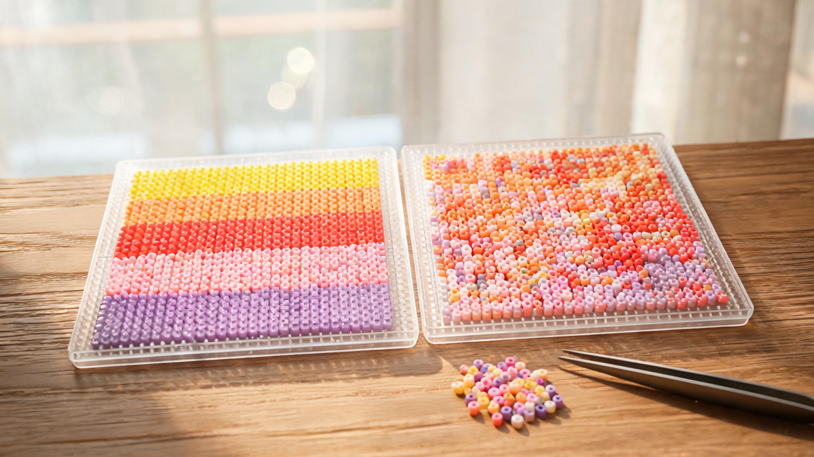
What It Changes
Dithering mixes two nearby bead colors in alternating cells to simulate shades between them. Off keeps flat regions of one ID. Auto applies dither only where gradients need it. On dithers aggressively across smooth areas.
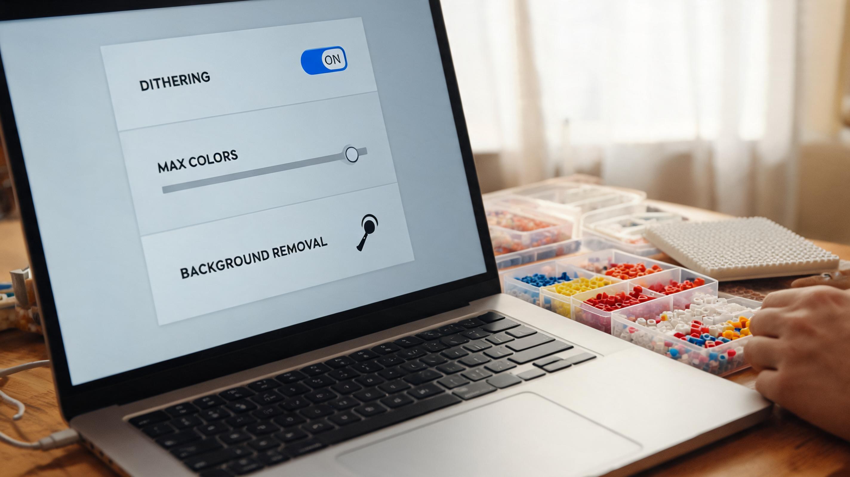
- Off — crisp poster-like areas; best for logos and flat cartoon art.
- Auto — default compromise for photos with soft backgrounds.
- On — maximum grain in skies and skin tones; can increase color count.
When to Use It
Use Off for pixel art, flags, and designs with hard edges. Try Auto for portraits and sunsets. Use On only when Off looks banded and you accept extra sorting work.
What Can Go Wrong
Heavy dithering creates checkerboard micro-patterns that are slow to place bead-by-bead. It also adds colors that each appear only a handful of times.
Recommended Starting Point
Start with Off for art with clear outlines. Start with Auto for photos. Switch to On only after Off/Auto show obvious color bands in large gradient areas.
What to Check in the Preview
Look at cheeks, skies, and table surfaces. Toggle dither and watch whether bands disappear or speckle appears. Check Materials count after each change.